Everyday mobile, a coffee shop UX study
Kurt McIntire
03.27.2014
Today I stopped by one of my favorite coffee shops. Unexpectedly, I ended up diving into a fun conversation about mobile user interface design and optimizing for barista tips.
After placing my order, the barista swiped my credit card and handed over an iPad running a Point of Sale app. The app showed my subtotal and presented three suggested tip amounts, a custom tip button, and an option for no tip. The placement of these buttons was, from left to right, “15%, 20%, $1, Custom Tip, and No tip”. Always curious about mobile UI, I asked the barista if the app results in better tips. To my surprise, she said, “No”.
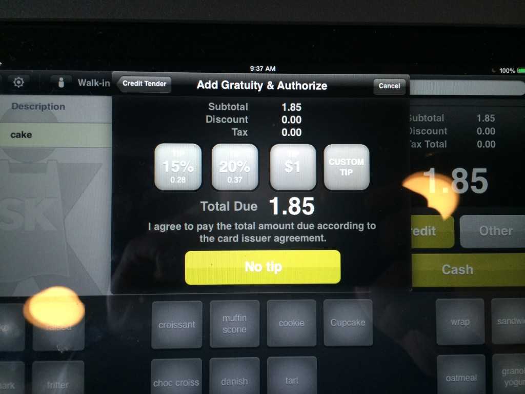
Does this iPad Point of Sale app increase barista tips? How would you restructure the UI?
She explained that before the iPad app, customers received a receipt that required their signature and a line for writing the tip amount. With this method, many customers wrote tips of $1.00. But now, with the iPad app, customers frequently hit the 15% button, resulting in a tip that is almost always less than $1.00 for the sale. As you can see in the photo above, for my 15% tip on $1.85 amounted to $0.28.
As a coffee shop customer, the app definitely made my life easier. I didn’t have to pick up a pen, do math, and write a custom tip amount. And on the barista’s end, they don’t have to play the “Where’s the pen?” game with me. But for all the benefits of this sleek system, there was a drawback – lower tips.
As mobile designers and developers, it’s sometimes hard to predict how apps will perform in the wild. Because of this, it’s important to know that an app is always a work in progress. No matter how much effort goes in to upfront design and architecture, the market always manages to surprise us.
Instead of getting rid of this app, I think it’d be smart to try a few iterations on the UI to get tips back to their old amount.
Baseline
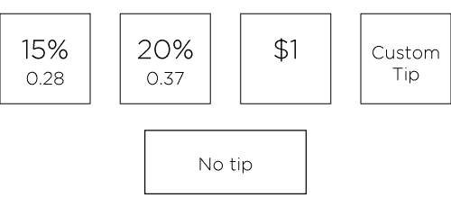
Test 1
Moving the $1 button to the far left. Potentially more customers would go for the $1 amount because it is the first button they see, left to right.
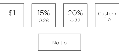
Test 2
Leaving the button order the same, but reversing the font sizes for the 15% and 20% tip amounts. The idea here would be to emphasize the dollar amount that customers are giving to barista, as opposed to the percentage.
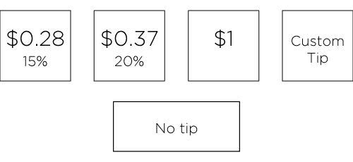
Test 3
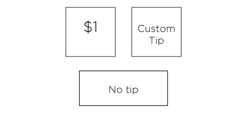
Eliminating the 15% and 20% tip options. Would removing the 15% and 20% options focus customer attention to the $1 and Custom Tip amount options and result in more sales?
Conclusion
As long as we’re speculating, how would you change the UI to optimize it for sales? What tests would you run? If you have ideas, message me on Twitter.